Kitchen Cabinet Color Trends 2026: Fresh Ideas for a Timeless Kitchen
What if the most exciting cabinet color for your kitchen isn’t the one that looks best in a photo? The kitchen cabinet color trends 2026 bring fresh options, from earthy greens and inky blues to warm neutrals and natural wood. The right choice depends on more than what’s trending: daylight, flooring, countertops, and existing finishes all shape how a color feels once it fills the room.
A dramatic shade can look appealing online, then feel too bold across every cabinet. A safe neutral may seem timeless, but you still want a kitchen that reflects your taste and feels connected to your home. A thoughtful palette can do both. Start with the finishes you’re keeping, decide how much contrast you enjoy, and use trend ideas to refine your direction.
This guide compares leading cabinet color directions for 2026, including expressive hues, flexible neutrals, natural wood tones, and two-tone combinations. You’ll find practical ways to assess light, coordinate colors with fixed finishes, and test a palette before settling on it. The aim is not to follow a trend blindly, but to choose a look that feels inviting, personal, and right at home.
Kitchen Cabinet Color Trends 2026: What Is Shaping This Year’s Palettes?
Trends are a source of ideas, not rules for your renovation. The kitchen cabinet color trends 2026 being discussed in design coverage point toward warmer neutrals, nature-inspired greens, nuanced blues, and natural wood. Use those directions to begin exploring, then weigh them against your kitchen’s light, counters, flooring, and the colors you enjoy living with.
A cabinet color never stands alone. Nearby materials and changing light affect its appearance and the overall feel of the room. For background on how cabinetry has evolved in home design, explore this overview of the history of kitchen cabinets. Treat each trend as a starting point, then consider how it works with your own finishes.
Are warm neutrals replacing crisp white cabinets?
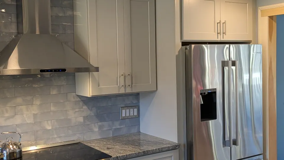
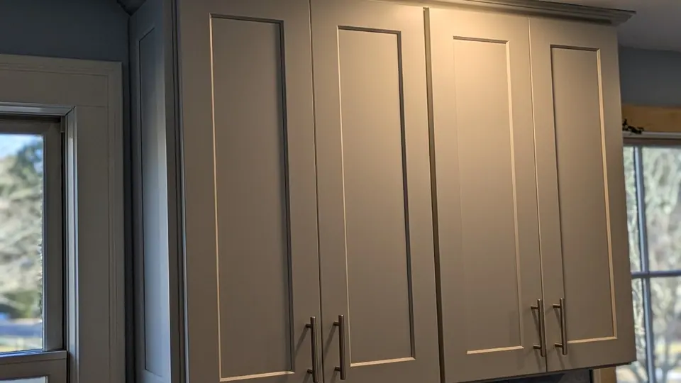
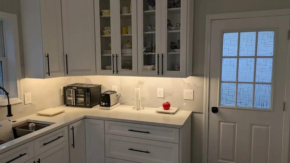
No. White remains a flexible choice, and the palette now includes a wider range of whites and neutrals. Creamy whites, soft taupes, and greige can feel gentler than crisp, bright white, especially beside warm wood or stone. Undertones affect the pairing: warm white may look creamier beside a cool gray counter, while a cooler white can appear sharper against warm flooring. Compare color samples directly with the materials they’ll sit beside.
Why are green, blue, and wood tones appearing in trend conversations?
Current trend discussions include muted greens such as sage and olive, along with blues that read smoky or inky rather than bright. Natural wood adds visible grain and warmth, bringing texture to a restrained palette. These are broad directions, not a guarantee that one shade will suit every kitchen. Specific colors and their popularity vary by source, region, and personal preference.
2026 palette directions at a glance:
- Warm neutrals: Cream, warm white, taupe, and greige offer a softer alternative to stark white.
- Nature-inspired greens: Muted, earthy shades can give cabinetry a grounded quality.
- Nuanced blues: Smoky or inky tones add depth without relying on vivid primary blue.
- Natural wood: Visible grain contributes warmth and material character.
Start with the finishes you’re keeping and the atmosphere you want. Then use these directions to narrow your choices. A color that suits your home will feel more considered than one chosen simply because it’s having a moment.
How Light, Undertones, and Finishes Change Cabinet Color
An undertone is the subtle warm, cool, or neutral cast beneath a color’s main appearance. It differs from brightness: two cabinet samples can be equally light, yet one may look creamy and the other faintly blue-gray. These small differences matter beside counters, backsplash, flooring, and wall paint.
How does natural light affect kitchen cabinet colors?
Light changes what your eyes notice. Window direction, nearby trees, and room layout affect how much direct sun reaches the cabinets and how colors appear through the day. In a Cape Cod home, a kitchen shaded by trees may look different from one with open southern exposure. Check samples in the actual room at several times of day, including after sunset with your usual lights on.
| Light condition | Likely visual effect | Sample-testing advice |
|---|---|---|
| Direct or strong daylight | Colors may appear brighter, and subtle undertones can stand out. | Look at the sample near the cabinets and where sunlight reaches the room. |
| Indirect daylight or tree shade | A color may seem softer or more subdued. | Check whether the shade still feels warm, cool, or balanced in dimmer areas. |
| Evening lighting | Bulb color can shift how warm or cool a cabinet looks. | View it under the lighting you use most often at night. |
What do undertones and sheen change in a cabinet finish?
A warm undertone can make white read creamy or gray lean toward beige. A cool undertone can make white feel crisper or gray look faintly blue. Neutral undertones tend to appear more balanced, though nearby surfaces still influence perception. Sheen matters, too. Matte surfaces reflect less light and look more subdued, while satin and higher-sheen finishes reflect more, creating brighter highlights and making surface texture more noticeable.
Screen images are useful for gathering ideas, but display settings and room lighting can make colors look unlike the real finish. Compare physical samples with your counters, backsplash, floor, and wall color. View them in daylight and under evening lights before settling on a palette. Kitchen design and measurement can help you consider cabinet colors alongside the room’s existing elements. Explore kitchen design and measurement as you plan the full space.
Warm Neutrals, Greens, Blues, or Two-Tone: Which Trend Fits Your Kitchen?
Popularity is a useful design signal, not a verdict on what belongs in your home. The kitchen cabinet color trends 2026 include flexible neutrals and wood as well as expressive greens and blues. To narrow the options, start with the fixed finishes you’re keeping. A cabinet shade should work with your counters and flooring, not compete with them.
| Palette | Room impression | Suitable use | Potential trade-off |
|---|---|---|---|
| Warm neutrals | Soft, calm, and welcoming | Cabinets throughout the kitchen or a quiet backdrop for distinctive counters | Subtle undertones may clash with cooler fixed finishes |
| Natural wood | Warm and tactile, with visible grain | A restrained palette that benefits from material texture | Wood tone and grain become prominent parts of the room’s look |
| Greens | Earthy and grounded | An island or cabinet run that needs a gentle color statement | A strong shade may dominate if repeated across the room |
| Blues | Rich, cool, or dramatic, depending on the shade | A focal area balanced by lighter surrounding finishes | Deep tones may feel visually heavy in some spaces |
| Two-tone | Layered, with clear contrast | An island, lower cabinets, or a selected run in a second color | The two finishes need to relate to each other and the room |
When do warm neutrals or natural wood make the most sense?
Warm neutrals can offer flexibility when coordinating cabinets with existing counters, flooring, and hardware. Natural wood brings visible grain, so the palette can feel textured without relying on several strong colors. Neither option is automatically neutral in effect: wood can become a focal feature, and creamy cabinets may feel out of place beside cool gray surfaces. For more cabinetry considerations, see this guide to affordable kitchen cabinets for Cape Cod.
How can green, blue, or two-tone cabinets add personality?
A stronger color doesn’t have to cover every cabinet. Try concentrating green or blue on an island or one cabinet run, with lighter or more understated cabinetry around it. Project galleries sometimes show combinations such as natural-wood lowers with white uppers or teal paired with white. Use these examples to understand contrast, not as a formula. For broader renovation context, explore this guide to Cape Cod coastal kitchen design and remodeling.
Choose a palette that works with your home’s fixed finishes and the mood you want, then use trend direction as a filter. A measured color choice can feel current without making the kitchen seem like a snapshot of one season.
How to Choose a 2026 Cabinet Color You Will Still Enjoy
A trend can catch your eye, but your materials and preferences are a better place to begin. Use this five-step process to move from inspiration to a palette that feels right in your kitchen, not just on a screen.
- Identify fixed finishes. Note the elements you plan to keep, such as countertops, backsplash, flooring, wall color, and prominent hardware. Their undertones and patterns should guide your palette.
- Assess the light. Consider where daylight enters, which areas stay shaded, and how the kitchen looks under evening lights. A sample that feels balanced in one corner may read differently elsewhere.
- Choose a palette direction. Begin with the atmosphere you want, such as calm and understated, warm and natural, or more colorful. Decide how much contrast you enjoy, then consider how kitchen cabinet color trends 2026 relate to your personal style instead of choosing by trend ranking alone.
- Test samples. Place physical samples near the counter, backsplash, floor, and wall finish. Compare neighboring shades together, since small undertone differences are easier to spot side by side.
- Review the whole room. Step back and look at how the cabinets relate to the kitchen as a complete space. Check whether the color feels cohesive from different angles and in both daytime and evening light.
What should you check before choosing a cabinet color?
Give special attention to finishes that are permanent or costly to change, including counters, flooring, and tile. Note your practical preferences, too. Do you want the kitchen to feel bright, cozy, or dramatic? How much contrast feels comfortable? Consider the visible marks and upkeep associated with your chosen finish. Inspiration photos can help you describe a look, but they can’t reproduce your home’s exact light, materials, or screen settings.
In a compact kitchen, color can affect how connected or visually busy the room feels. Consider whether a single cabinet color or restrained contrast better supports the space, and explore these small kitchen design ideas for Cape Cod homes for more planning context.
How can you test a cabinet color before committing?
View samples beside the kitchen’s actual surfaces, not against a blank wall alone. Check them at different times of day and compare nearby shades in the same light to spot subtle shifts. Then look at the palette from across the room. Kitchen design and measurement can help you assess cabinet choices alongside existing finishes. Include kitchen design and measurements in your planning so the color works with the full space.
Bring 2026 Kitchen Cabinet Color Ideas Together with a Thoughtful Remodel
The best cabinet palette isn’t simply the one making headlines. It’s the one that feels at home with your kitchen’s light, layout, and existing finishes, and that you’ll enjoy using for years. Kitchen cabinet color trends 2026 can offer a helpful starting point, while a cohesive remodel connects your chosen color with the rest of the room.
How do cabinets connect with the rest of a kitchen remodel?
Cabinet color has a close relationship with flooring, wall finishes, backsplash, and countertops. Warm cabinets beside cool tile, for example, may create deliberate contrast or feel disconnected, depending on the other materials. Review these finishes together during planning so the palette feels considered rather than assembled one decision at a time.
Measurements and layout also shape how cabinetry fits the space and where color carries the most visual weight. An island, a long cabinet run, or a compact kitchen can each affect how prominent a shade feels. A coordinated plan can bring flooring installation and interior painting into the wider design conversation. For more on completing the room, explore Cape Cod kitchen finishing and home improvement services.
How can a local design process make color decisions easier?
At Affordable Cabinets of Cape Cod, kitchen design and measurement, cabinetry, and cabinet installation support projects from early planning through bringing the chosen look together. Shaker-style and Ready-To-Assemble cabinets are among the cabinetry options available. Start with your vision, whether you’re drawn to a quiet neutral, a natural wood look, or a more expressive color, and consider it alongside your kitchen’s dimensions and finishes.
Cape Cod homes vary in character and light, so a coastal palette isn’t a requirement for a local kitchen. The aim is to find a color direction that suits your home, rather than applying one regional style to every space. As you plan, consider how cabinet, floor, and wall finishes will work together in the rooms you use every day.
If you’re ready to explore those ideas as part of a kitchen project, explore kitchen design and remodeling with Affordable Cabinets of Cape Cod.
Choose a Cabinet Palette That Feels Like Home
Kitchen cabinet color trends 2026 offer plenty of inspiration, from warm neutrals to earthy greens, nuanced blues, and natural wood. The most lasting choice is one that works with your kitchen’s light and existing finishes, and creates the atmosphere you want. Testing samples in the room and considering the whole palette can help you look beyond the first impression.
Color decisions also benefit from a plan that connects cabinetry with the kitchen’s layout and other finishes. Affordable Cabinets of Cape Cod is a locally owned and operated business serving Cape Cod, with kitchen design and measurement, cabinetry, and professional cabinet installation to bring those choices together.
Ready to turn inspiration into a practical plan for your home? Explore kitchen design and remodeling with Affordable Cabinets of Cape Cod. Choose a palette that feels true to your home and start planning a kitchen that welcomes you every day.
Frequently Asked Questions
What are the most popular kitchen cabinet colors for 2026?
Current kitchen cabinet color trends 2026 discussions include warm neutrals, earthy greens, nuanced blues, and natural wood tones. Two-tone designs also offer a way to add contrast. Popularity doesn’t mean every shade suits every kitchen, so consider your counters, flooring, light, and personal taste before choosing a color.
Are white kitchen cabinets still in style in 2026?
Yes, white cabinets remain a flexible choice, and the surrounding palette and shade can change the overall look. Creamy and warm whites offer a softer impression than crisp, cool whites. Either can work, depending on the kitchen’s finishes. Compare samples beside countertops and flooring, since their undertones can make white appear warmer or cooler.
Are green kitchen cabinets a good choice for a small kitchen?
Green can work in a small kitchen when the shade and placement feel balanced. Muted sage across the cabinets may feel calmer than deep, saturated green, while green on an island or a single cabinet run adds color without covering every surface. Check the shade with your flooring, counters, and natural light. Room size alone doesn’t determine the right palette.
How do I choose a cabinet color that matches my countertops?
Choose a cabinet color that coordinates with your countertop’s undertones and pattern rather than trying to match it exactly. A counter with warm beige or cream veining may pair comfortably with warm white or taupe cabinets; cooler gray tones may call for a different balance. Place cabinet samples beside the counter, then consider the backsplash and flooring. Seeing these finishes together helps reveal whether the palette feels cohesive.
What cabinet colors make a kitchen look brighter?
Light colors such as soft white, cream, and pale neutrals can help a kitchen feel brighter by keeping the palette visually light. The result still depends on daylight, room layout, and surrounding finishes. If the kitchen has limited natural light, review samples in daytime and evening conditions. Pairing a light cabinet color with restrained contrast can maintain an open feel without making every surface stark white.
Are two-tone kitchen cabinets still in style in 2026?
Yes, two-tone cabinetry continues to appear in 2026 design discussions. A different color on an island, lower cabinets, or one selected run can introduce contrast without making every cabinet bold. For example, lighter perimeter cabinets can balance a deeper island color. To keep the combination harmonious, consider how both shades relate to each other and to the kitchen’s counters, flooring, and wall finishes.
How can I test a kitchen cabinet color before choosing it?
View physical color samples beside your countertops, backsplash, flooring, and wall finish, then compare nearby shades together. Check them in daylight and again in the evening under your usual lighting. Across Cape Cod communities such as Mashpee, Bourne, Cataumet, Pocasset, Falmouth, Sandwich, Marston Mills, Centerville, Hyannis, Brewster, Yarmouth, and Dennis, home layouts and daylight vary. Judge samples in your own kitchen rather than relying on screen images.